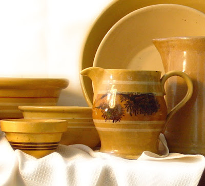
The ChallengeWe had 7 days left to pack all of our belongings and move to another state. With a swarm of mess surrounding me, I heard myself say, "yes" to this commission. Was I crazy? I still don't know (although my husband may tell you that he does). Against every practicality, I took on the challenge of painting in 2 days the largest still life I have ever attempted. Before I knew it, 16 pieces of exquisite
yellowware, a few apples, and some fresh daisies were facing me, ready to be reproduced on a 16"x36" linen canvas. In the 20 hours of painting that followed, I wrestled with all the doubts, fears, and frustrations that artists face when brush meets canvas.
The SubjectSome of you are thinking, what is
Yellowware? I thought the same thing when Elisa commissioned a painting of her
yellowware collection. Here is the skinny on this handmade kitchen fascination taken from
Martha Stewart's website.
 "From the 1830s until the 1940s, when Pyrex and plastics took over, yellowware was ubiquitous in American kitchens. Yellowware is a ceramic fired from the fine yellow clay that lines riverbanks from New York to Ohio. Its color ranges from butter yellow to deep mustard, and it was popular due to its low cost and durability -- it could even withstand the heat of a woodstove."
I knew that these were special pieces, not only by how much Elisa told me she paid for her smallest bowl, but it was evident in each unique chip, imperfection of line, each variance of shade, and evidence of use. Each lovely piece was a unique gem with a story to tell. My hope was that this would come through in each brushstroke.
The Setup
By the brilliant suggestion of my husband, we took my table top off its stand and placed it up on top of my art supply chest in order to get a straight-on perspective while I sat to paint. After this photograph, I sent him out to fetch some bright white daisies to break up the yellow of the dishes and darkness of the table. I also added a white table cloth to give an area of soft edges.
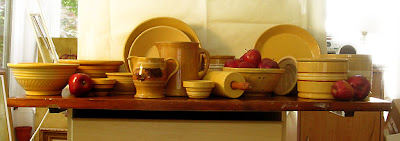
Surprisingly (and I believe by God's help) it only took me about 30 minutes to arrange all the pieces. Perhaps another 10 minutes once I decided to add the towel and daisies. The apples were an easy choice for the purpose of breaking up the yellow, and to also bring out the deep brown stripes on some of the pieces.
It is difficult to tell in the photograph, but there are many varying shades of yellow. The pieces are arranged not only by shape and composition, but also each piece is set beside, against or in front of a piece with a lighter or darker shade. This was done in order to create as much contrast as possible so that the pieces don't get lost in a sea of yellow. For surely not all beautiful things make a successful painting, the consistent color would prove to be a challenge.
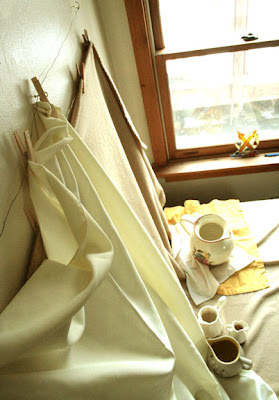
The SetbackThe thing that makes my studio so beautiful and enjoyable is also what causes much difficulty in painting. If you remember my comments on my studio in a previous post, you will understand what a day of fast moving clouds on a sunny day will do to ones sanity while painting.
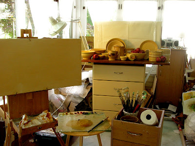
Usually, I can adjust to changing light and paint finishing as I go. This can be done if the light stays the same for at least 15 minutes at a time. On this particular day, the sun was beaming in brightly then was hidden behind clouds. Back and forth it went several times each minute, making it quite impossible to accurately paint anything. It was not possible to put off the painting for another day - it had to be today or not at all. I was close to accepting defeat until my husband once again saved the day with another brilliant idea.
The Solution
It would be difficult and nerve wracking, but we had to do it. We cleared out our second bedroom, covered the window with cardboard, and very cautiously lifted the tabletop and carried the entire setup - dishes, apples, from the front porch, all through our cluttered half packed house, into the bedroom, and onto the dresser. Amazingly it was the same height as the other one, and I had just enough room to achieve the same distance and angle from the still life.
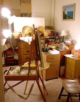 Please excuse the packing clutter.
 And please notice the wonderful lighthouse painting on the wall.
It is my husband's handiwork.
It was also a great help to me in that, I could now paint at night with consistent lighting. This also would be a huge factor in the completion of the painting, as I was not guaranteed continual sunny days.
The Progression
Well, enough with the prep, lets get to it and see how this painting came to be.
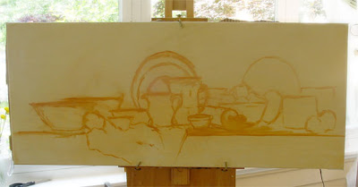
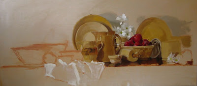
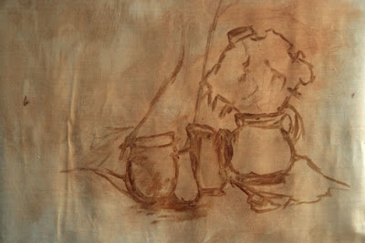
As usual, I start with a rough sketch in a burnt sienna wash. As time goes by, I find that I don't need to draw in each detail, but merely give myself an indication as to where things will be. I paint to finish as I go, and find this to consistently be the best way to avoid an overly tight painting and it helps keep it fresh and spontaneous looking.
I believe the first thing I painted was the daisies on the lower right. I knew that since they weren't in water that they would fade and droop quickly. Besides, they were the most fun to paint and are my
favorite part of the painting. It's best, if possible, to begin painting where one feels the most confident - choose the easiest shapes first. Having one part correctly painted will help set the tone and the confidence will carry on throughout the painting to the more difficult sections.
I believe it was at this point, late at night that my dear husband brought me a milkshake.
I love him.
Up until this point I was unsure as to how to handle the dishes on the outer edge and the background. I was sure, however, that the crock on the right was too close to the edge of the canvas and should not be brought to a finish. I then decided that the outer pieces should be looser and more of a hint of detail in order to bring one's eyes back into the painting. I also decided that the background should be simple, yet have some movement to it, and settled on a rough look with varying values and temperatures.
The Finish Line
Here are a few closeups and comments for your enjoyment.
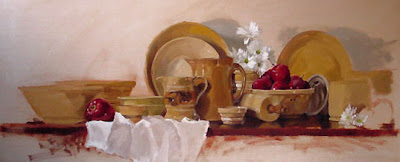
Pieces on the right are blocked in and will be adjusted and corrected later.
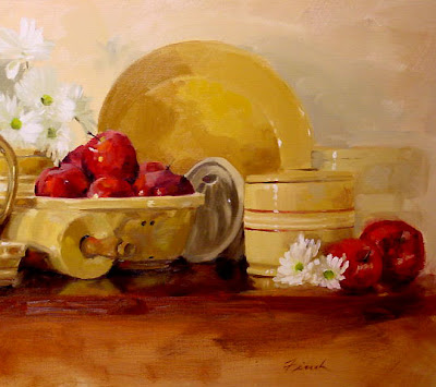
Simple highlights and some indications of detail were given to the outer crock to engage the viewers mind to complete the image, to avoid a tangent at the edge of the painting, and to bring the viewers eye back into the painting.
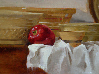
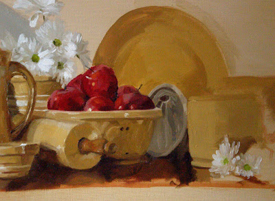
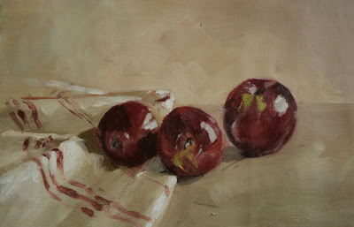
With all of this yellow, it was important to seek out those colors that one might not expect to find, and perhaps accentuate them a bit to create some interest and contrast. I punched in some pure red cadmium in the apples, added some cool blue splashes and deep reds to the
yellowware's shadow side, and allowed some of my burnt sienna
under drawing to show through in select areas.
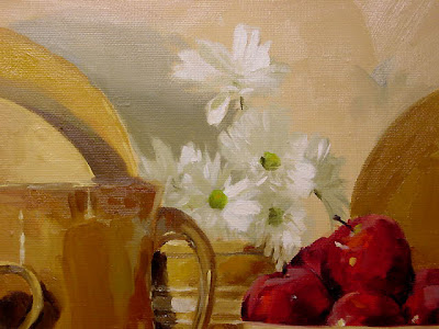
Sometimes the quickest objects to paint become my favorite. The daisies had clear light and shadow, were a refreshing contrast to the object of focus, and were playful additions to the painting. It was the most enjoyable half hour of this commission.
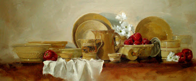
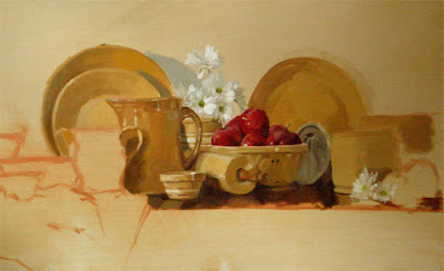
Seen here is the finished painting, after over 20 hours of solid painting, it was finally finished. The painting then spent another day and night in front of a fan to be sure the piece was dry enough to send home with its teary owner.


 Sydney and Sherman
 Not a Prince
 African Baby
 Don't Forget to Remember
 The Picture Book
Currently on Art Sightings:
Currently on Artist Sightings:
Currently on Art Resource Sightings:


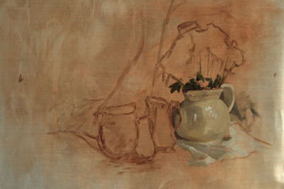


 As you can see from the progressions, the flowers were not originally in the still life. About halfway through it became obvious to me that something was needed in order to keep the painting from appearing monochromatic.
 I decided not to dilly dally one bit and after a quick placement sketch, I dove into the deep cobalt shapes to establish the tiny pitcher, blocking in obvious tones as I went.
 After a break I continued with more exact edges and values, adding more detail to cause the pitcher to appear more sold and established. The flowers continued to get some attention. I was focused on creating more contrast between the shadows and bright light side of the petals. More paint was added to the previously washed in background and foreground.
  Thinking on Her
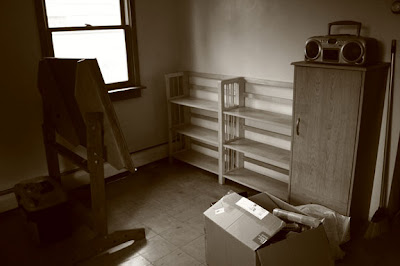
 I have two wonderful windows. One facing west and the other facing north.
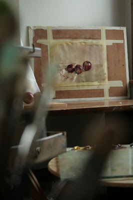
 "From the 1830s until the 1940s, when Pyrex and plastics took over, yellowware was ubiquitous in American kitchens. Yellowware is a ceramic fired from the fine yellow clay that lines riverbanks from New York to Ohio. Its color ranges from butter yellow to deep mustard, and it was popular due to its low cost and durability -- it could even withstand the heat of a woodstove."